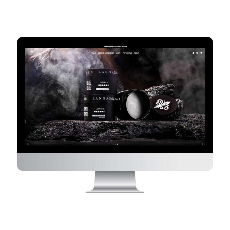
Responsive Web Design Explained
Responsive Web Design Explained: What Does Responsive Mean in Web Design?
A plain-English guide to how responsive websites adapt to phones, tablets and desktops, why it matters for your customers and your Google rankings, and how to check your own site.
If you have ever asked what does responsive mean in web design, here is the short answer: it means one website that automatically rearranges itself to suit whatever screen it is viewed on. The same page reads comfortably on a phone in a customer’s hand, a tablet on the kitchen bench and a widescreen monitor in an office, without anyone pinching, zooming or scrolling sideways.
That sounds simple, and for visitors it should feel simple. Behind the scenes, though, responsive design is one of the most important decisions in any web design project, because it decides whether most of your visitors can actually use your site. This guide explains what responsive design is, why it has become essential, how it adapts to different screens and what it does for user experience and SEO. If you would rather have someone check your site for you, Adelaide Web Design Agency offers a free strategy call that includes an audit of your existing site.
What is Responsive Web Design?
So, what does responsive mean in web design? A responsive website uses flexible layouts, scalable images and a set of CSS rules called media queries to detect the size of the screen and reflow its content to fit. One site, one set of content and one web address serve every visitor, whether they arrive on a phone, a tablet, a laptop or a large desktop monitor.
It helps to remember what came before it. In the early days of smartphones, businesses either left their desktop site as it was, which meant tiny text and fiddly links on a phone, or paid for a separate mobile site on its own address. Two sites meant two sets of content to update, split search rankings and plenty of broken links. Responsive design replaced both approaches with a single site that adapts.
A responsive site is built on three ingredients that work together:
Fluid Grids
Page sections are sized in percentages rather than fixed pixels, so columns stretch and shrink with the screen instead of spilling off the edge.
Flexible Images and Media
Photos, videos and embedded maps scale to fit the space they sit in, which keeps a hero image looking sharp on a monitor and sensible on a phone.
Media Queries
Rules in the site’s code check the screen width and switch layouts at set points, called breakpoints. That is how three columns become one and a full menu becomes a tap-to-open icon.
Why is a Responsive Website Essential?
A decade ago a responsive site was a nice extra. Today it is the baseline, for four reasons that matter to any Adelaide business relying on its website for enquiries.
Your Customers Are on Their Phones
Whether someone is looking for a plumber at 7am or a restaurant at 7pm, the search usually starts on a mobile. If the page they land on is hard to read, they leave and try the next result.
Google Looks at the Mobile Version First
Google primarily uses the mobile version of a site when it decides how to index and rank it. A site that only works well on desktop is being judged on its weakest version.
One Site Is Easier to Maintain
With a single responsive site there is one set of pages to update, one set of forms to test and one address to promote. Content changes happen once and appear correctly everywhere.
Enquiries Depend on It
Calls, bookings and quote requests happen when the button is easy to find and the form is easy to fill in with a thumb. Responsive layouts are what make that possible on small screens.
“If your website only behaves properly on a desktop, you are asking most of your customers to do the hard work.”
How Responsive Design Adapts to Different Screens
The easiest way to understand responsive design in practice is to watch what happens to a page as the screen gets smaller. A well built site makes five predictable changes.
What Changes as the Screen Shrinks
Columns Stack Into One
A three-column row of services on a desktop becomes a single column on a phone, so each block is read in order rather than squeezed side by side.
Navigation Collapses
A full menu bar becomes a compact icon that opens a simple list. Important actions such as Call or Book often stay visible in the header.
Images and Video Resize
Media scales to the width of the screen, and large decorative images may be cropped or swapped for lighter versions so pages stay fast on mobile data.
Text and Buttons Adjust for Thumbs
Font sizes and line lengths change so paragraphs stay readable, and buttons grow into comfortable tap targets with space around them.
Content Is Prioritised, Not Hidden
The most important information moves to the top of the page on mobile. Good responsive design reorders content rather than hiding it, so phone users get the full story.
Those changes are triggered at breakpoints. The exact numbers vary from site to site, but most designs plan for three broad screen sizes:
Phones
Roughly up to 600 pixels wide. Single column, large tap targets, a collapsed menu and a click-to-call button close to the top.
Tablets
Roughly 600 to 1,024 pixels. Two columns where it helps, a condensed menu and layouts that work in both portrait and landscape.
Desktops
Above 1,024 pixels. The full layout with multiple columns, wider images and a complete navigation bar, while line lengths are still capped so text stays readable.
Not sure whether your current site is responsive? Open it on your phone and run through this quick test:
- ✓ Text is readable without zooming in
- ✓ Nothing scrolls sideways or hangs off the edge of the screen
- ✓ The menu opens and closes cleanly with a tap
- ✓ Buttons and links are easy to hit with a thumb
- ✓ Forms can be filled in without fiddling
- ✓ Images load quickly and are not awkwardly cropped
Want a second opinion on how your site performs on mobile? We check it in every free strategy call.
Benefits for User Experience and SEO
Responsive design pays off twice: once with the people using your site and again with the search engines ranking it. Both matter, and they reinforce each other.
For your visitors
- ✓ Readable text and comfortable spacing on any device
- ✓ No pinching, zooming or sideways scrolling
- ✓ Faster paths to call, book or enquire from a phone
- ✓ A consistent brand experience from mobile to desktop
- ✓ Fewer frustrated visitors leaving before they read your offer
For your search rankings
- ✓ One URL for every device, so links and ranking signals are not split between two sites
- ✓ A strong mobile version, which is the version Google indexes first
- ✓ Better engagement signals such as longer visits and fewer instant exits
- ✓ Easier page speed optimisation when there is one site to tune
- ✓ Google’s own documentation recommends responsive design as the simplest pattern to build and maintain
This is why every website we build at Adelaide Web Design Agency is a fully responsive WordPress site. Mobile optimisation is included in every package, from the Starter website upwards, and each build is checked on desktop and mobile before it goes live. If you want a site that behaves well on the screens your customers actually use, our WordPress web design service is the place to start.
Frequently Asked Questions About Responsive Web Design
Quick answers to the questions Adelaide business owners ask us about responsive design.
Adelaide’s Web Design Experts
Ready for a Website That Works on Every Screen?
Every site we build is fully responsive, mobile optimised and tested before launch. Book a free 30 minute strategy call and we will audit your current site, show you how it behaves on mobile and map out the fix.
Book Your Free Strategy Call with Adelaide Web Design Agency
Free consultation · No obligation · Local Adelaide team